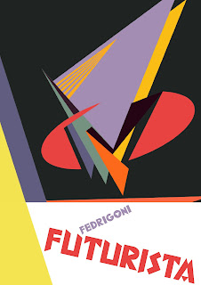
Now I am more happy with the overall feel of the text that I am using here. I am allowing the shape in the background to change the colour of the text, the background shape and text invert as they meet each other. This is a technique used in Depero's work when dealing with text, and something that I really like. I know that I need to further edit the text so that the change in colour is along the line of the background shape rather than just changing the colour of individual letters. (see next stage of this poster). I really like the composition however, I think it is effective that the abstract shape is floathing in the middle, only slightly bleeding of the top of the page.
Above is my final idea for this abstract art piece that I created. I really like it as a poster. I think it suggests everything that I wanted the piece to say. It is modern, has a futurist feel to it, and also aesthetically balanced. The caption Fedrigoni Futuristi is bold and powerful. The angles create dynamism. I will keep the text that you see here throughout the posters that I will be designing to give it some consistency That way they will look more like a set of posters. I plan to change the colour of the type to suit each poster design.
Here I am deleting elements of the abstract art piece that I created to try and get an outcome that looks conistant in style to the previous poster I have created. For this, I want the abstract art piece to be integrated with the lower part of the poster. Obveously, when first working with the art piece it has been designed in a square format so I have extended shapes and colour areas into the lower proportion of the poster. I think this is starting to work, but the type is crossing more than one colour area and so instead of the type inverting, it is changing colour 3 times which is not consistant with my previous posters. Also, the red and yellow colours are a little overpowering. I need to keep working at it to try and get all of the colours working together.
This is my final poster design. The background colour and type placement are in the same position as the previous poster. Also, the way that the type sits within the triangle is consistent. I have worked the art piece around the triangle shape that sits behind the type. The poster is dynamic and high in contrast. I think that the sentence at the bottom of the poster "Fedrigoni is the most futuristic paper in the world" needs some work. It is not punchy enough. But this is just placement type and a working example of where the final type could sit.
Turning this piece of art into a poster that is consistent with the previous posters has been a lot simpler in process. The circle form sits directly in the centre of the square that I designed as an art piece, so I have kept the background consistant in colour with the previous posters and placed the text area below the form. I think it is a balanced, dynamic poster that has not needed much work other than a careful positioning of the art piece so that it sits central and the composition looks comfortable rather than awkward.
This piece is proving to be rather difficult in turning into a poster that looks balanced. I have initially placed the text and shape on the bottom of the poster. Now I am trying to create a design that suits this area of type and triangle shape. I actually quite like this poster over the other attempts as I think that it is consistent in layout and style. In indesign, I am designing all of these posters as pages so that I can view all of the posters together. This way, I am changing any areas of the posters that I feel are not working in the set.
This is the waistcoat poster that I am completing in the same way as the art piece posters. This way, all of the posters are consistant in style and they could be sent as a set to the printers, or they could be sent in a staggered process so that the posters work more like a campaign. I do however have some issues with this. I think that it could get confusing, having 4 posters that show a piece of art and then one poster in the set that shows marinetti in a futuristic waistcoat. Perhaps I need to consider trying to integrate the two ideas somehow into one format.


No comments:
Post a Comment