These are initial experiments for poster ideas. Obviously I am trying to break away from the bad half-tone attempt of the Marinetti poster that I completed. I am exploring bold colours, sharp lines and angles. I quite like the fact that the waistcoat is central to the image in these, I think they are most effective posters when they are on the flat colour background of Marinetti's outline. The text needs a lot of work. I quite like splitting the Fedrigoni word up here by colour, when intersects with the background image. I am not sure about splitting up the word futuristi into sylabuls however. This needs to be one colour, or needs to change colour only when it intersects another image like the Fedrigoni text. I have tried to put a triangle above the futuristi text almost like a drop shadow. This was just to try and play about with perspective like Depero did in his artworks. I want to explore this further. I think that the posters will need a 3 dimensional element to them. I am very happy with the choice of font, P22, and will continue using this as a font for my posters. I have definitely got the colour scheme of my posters now. I am using the same colour scheme as I did in the abstract artwork that I produced. I am designing the posters at an A2 size, however they are vector imagery for the majority, so can be scaled accordingly.


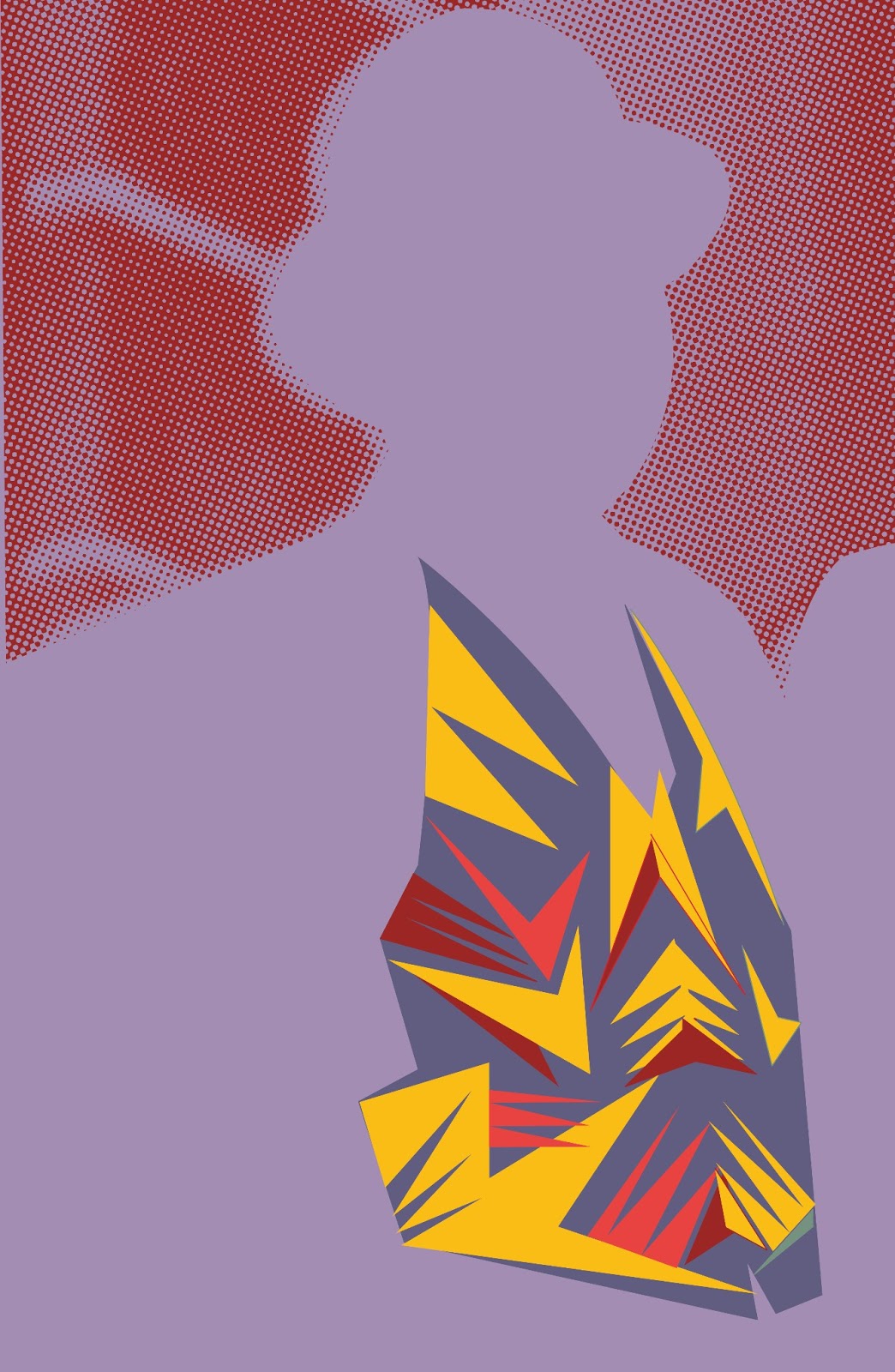
I quite like the halftone experiment in this image. It softens the background and draws more attention to the sharp colours of the waistcoat. I was worried that it was becoming hard to tell if the silhouette still looked like a man wearing a waistcoat. I have been working on this for some time now and you need an outsiders perspective to make sure you are being obvious with what you are trying to show. However, after asking numerous people who all said that it is a person wearing a waistcoat, I have concluded that this is obvious.

I am trying to bleed the futuristi text here off the page to try and give it a bit of dynamism. I am unconvinced by this however. The text needs a lot more experimentation and work.


This is starting to get somewhere. I have dropped the halftone pattern of Marinetti back into the composition. A more interesting composition is being created. I quite like the way that I have cut around Marinetti with the pen tool, it gives it a sharp edged look. I also like the guy that is staring at you in the right corner, it engages the viewer more.

I am really starting to play around here with type. I want to include a 3 dimensional aspect into my work but I do not think this has been successful. It is too forced, too fake and gimicky. I need to look back through my research to further explore this idea.


I definitely think that this is getting there. I like the positioning of text but I am still not happy with the colour of the text. I need to work on composition more. I have cropped out the guy that is staring at you. I think that he interrupts the composition and the direction that Marinetti is looking. I like the fact that Marinetti looks like he is looking into the future, this is what I want people to think about when they see this advertisement for Fedrigoni. I want it to reflect the fact that Fedrigoni are a forward thinking paper company.

No comments:
Post a Comment