Wednesday 27 March 2013

3d model of stand


This is a model that I have made to support the campaign that I have created. It features the same colours that I have used throughout the design of my Fedrigoni Futuristi campaign. I have made this 3d model with dynamism in mind. It is consistent in style to my posters and I think that overall, it is a really attractive and visually engaging model that would attract attention at trade shows. I imagine it to be constructed out of a solid construction material such as wood or plastic, and then covered in Fedrigoni paper and folded so that it looks like it is entirely constructed from Fedrigoni paper without support. 

Wednesday 20 March 2013

final poster designs


For the final poster designs, I have combined the waistcoat posters and the art piece posters. I have dropped Marinetti in his waistcoat over each of the designs. Whilst doing this, I have changed the colours of the waistcoat so that they are the same as the colours used in the artwork behind Marinetti. The final four posters are consistent in style and I believe they work well as a set. They are dynamic and reflect Depero's work well, the link is fairly obveous. 


Thursday 14 March 2013

Further poster development

I have been thinking about how I can tie everything that I have and that I have been doing together. I want to make a series of posters that include all that I have been working on. That is the waistcoat idea, the Fedrigoni Futuristi message and the abstract artwork. I do not know if the waistcoat idea and the abstract artwork should be on different posters with the same message and layout style? This is something that I need to explore. I do know however that they have to look consistant as a set and convincing as a message.


Now I am more happy with the overall feel of the text that I am using here. I am allowing the shape in the background to change the colour of the text, the background shape and text invert as they meet each other. This is a technique used in Depero's work when dealing with text, and something that I really like. I know that I need to further edit the text so that the change in colour is along the line of the background shape rather than just changing the colour of individual letters. (see next stage of this poster). I really like the composition however, I think it is effective that the abstract shape is floathing in the middle, only slightly bleeding of the top of the page.

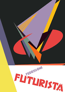
Above is my final idea for this abstract art piece that I created. I really like it as a poster. I think it suggests everything that I wanted the piece to say. It is modern, has a futurist feel to it, and also aesthetically balanced. The caption Fedrigoni Futuristi is bold and powerful. The angles create dynamism. I will keep the text that you see here throughout the posters that I will be designing to give it some consistency  That way they will look more like a set of posters. I plan to change the colour of the type to suit each poster design. 

Here I am deleting elements of the abstract art piece that I created to try and get an outcome that looks conistant in style to the previous poster I have created. For this, I want the abstract art piece to be integrated with the lower part of the poster. Obveously, when first working with the art piece it has been designed in a square format so I have extended shapes and colour areas into the lower proportion of the poster. I think this is starting to work, but the type is crossing more than one colour area and so instead of the type inverting, it is changing colour 3 times which is not consistant with my previous posters. Also, the red and yellow colours are a little overpowering. I need to keep working at it to try and get all of the colours working together. 


This is my final poster design. The background colour and type placement are in the same position as the previous poster. Also, the way that the type sits within the triangle is consistent. I have worked the art piece around the triangle shape that sits behind the type. The poster is dynamic and high in contrast. I think that the sentence at the bottom of the poster "Fedrigoni is the most futuristic paper in the world" needs some work. It is not punchy enough. But this is just placement type and a working example of where the final type could sit. 


Turning this piece of art into a poster that is consistent with the previous posters has been a lot simpler in process. The circle form sits directly in the centre of the square that I designed as an art piece, so I have kept the background consistant in colour with the previous posters and placed the text area below the form. I think it is a balanced, dynamic poster that has not needed much work other than a careful positioning of the art piece so that it sits central and the composition looks comfortable rather than awkward. 


This piece is proving to be rather difficult in turning into a poster that looks balanced. I have initially placed the text and shape on the bottom of the poster. Now I am trying to create a design that suits this area of type and triangle shape. I actually quite like this poster over the other attempts as I think that it is consistent in layout and style. In indesign, I am designing all of these posters as pages so that I can view all of the posters together. This way, I am changing any areas of the posters that I feel are not working in the set. 


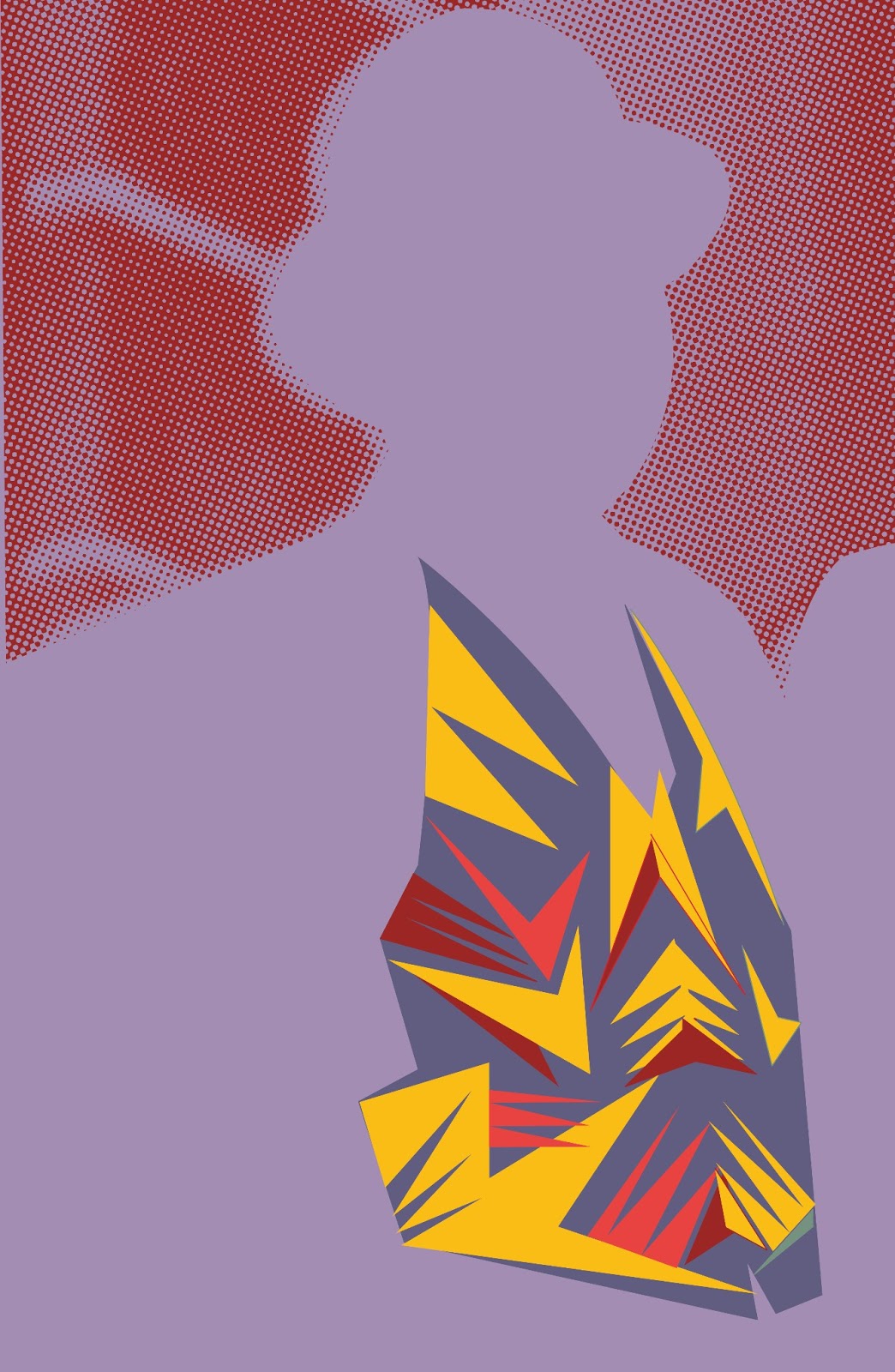
This is the waistcoat poster that I am completing in the same way as the art piece posters. This way, all of the posters are consistant in style and they could be sent as a set to the printers, or they could be sent in a staggered process so that the posters work more like a campaign. I do however have some issues with this. I think that it could get confusing, having 4 posters that show a piece of art and then one poster in the set that shows marinetti in a futuristic waistcoat. Perhaps I need to consider trying to integrate the two ideas somehow into one format. 


Friday 8 March 2013

Initial ideas for new posters


These are initial experiments for poster ideas. Obviously I am trying to break away from the bad half-tone attempt of the Marinetti poster that I completed. I am exploring bold colours, sharp lines and angles. I quite like the fact that the waistcoat is central to the image in these, I think they are most effective posters when they are on the flat colour background of Marinetti's outline. The text needs a lot of work. I quite like splitting the Fedrigoni word up here by colour, when intersects with the background image. I am not sure about splitting up the word futuristi into sylabuls however. This needs to be one colour, or needs to change colour only when it intersects another image like the Fedrigoni text. I have tried to put a triangle above the futuristi text almost like a drop shadow. This was just to try and play about with perspective like Depero did in his artworks. I want to explore this further. I think that the posters will need a 3 dimensional element to them. I am very happy with the choice of font, P22, and will continue using this as a font for my posters. I have definitely got the colour scheme of my posters now. I am using the same colour scheme as I did in the abstract artwork that I produced. I am designing the posters at an A2 size, however they are vector imagery for the majority, so can be scaled accordingly. 


I quite like the halftone experiment in this image. It softens the background and draws more attention to the sharp colours of the waistcoat. I was worried that it was becoming hard to tell if the silhouette still looked like a man wearing a waistcoat. I have been working on this for some time now and you need an outsiders perspective to make sure you are being obvious with what you are trying to show. However, after asking numerous people who all said that it is a person wearing a waistcoat, I have concluded that this is obvious. 


I am trying to bleed the futuristi text here off the page to try and give it a bit of dynamism. I am unconvinced by this however. The text needs a lot more experimentation and work. 


This is starting to get somewhere. I have dropped the halftone pattern of Marinetti back into the composition. A more interesting composition is being created. I quite like the way that I have cut around Marinetti with the pen tool, it gives it a sharp edged look. I also like the guy that is staring at you in the right corner, it engages the viewer more. 


I am really starting to play around here with type. I want to include a 3 dimensional aspect into my work but I do not think this has been successful. It is too forced, too fake and gimicky. I need to look back through my research to further explore this idea.


I definitely think that this is getting there. I like the positioning of text but I am still not happy with the colour of the text. I need to work on composition more. I have cropped out the guy that is staring at you. I think that he interrupts the composition and the direction that Marinetti is looking. I like the fact that Marinetti looks like he is looking into the future, this is what I want people to think about when they see this advertisement for Fedrigoni. I want it to reflect the fact that Fedrigoni are a forward thinking paper company. 


Tuesday 5 March 2013

Other paper constructed ideas

I have come up with other ways of using paper to construct items in the style of Depero's work. I have taken one of his art pieces and constructed it out of paper, and used my own font and wording on the tube that I have made. I have turned it into an initial idea for a poster, However I am not too sure about the delivery of the piece. I am fairly happy with the layout and the way it looks, but I have not yet come up with anything conclusive for an idea for a campaign, or a way that all my ideas will work together to create one message.


The text was just dummy placement text. Naturally, if this is to be a final poster idea, then the text would be more about how Fedrigoni is futuristic and cutting edge in the way they manufactor paper.

I have also started exploring a way that I can use the waistcoat that I have made out of paper in a poster design.


I quite like this poster idea. I have created it by printing out the background onto a1 paper, and also printing the type and the waistcoat, constructing the whole image by hand, and then re-photographing it. I wanted it to have a rough edged, handmade feel. It does do that. However, some problems have occurred  Firstly, because I have printed it, then rephotographed it, the image quality is poor. Secondly, the text is difficult to read. Thirdly, the background layer has not been halftoned correctly. I have used the colour halftone effect in Photoshop instead of the dot halftone screen effect. Therefore I have weird circles around each of the circles constructing the image. I like the idea of half toning the image as it is of poor quality. However, I have not done it very effectively. I need to play about with composition of this poster, and also I need to make it digitally and vectored. I do not know why I produced it by hand. I did not really need to do this, I just need to visualize the posters, I do not necessarily have to create them. This therefore is the next stage in my development of this Fedrigoni project. I am going to work on this poster, and see if this directs me to a way of bringing all of this material together as one campaign/poster set. 

Monday 4 March 2013

The waistcoat constructed


I have had a lot of fun creating the waistcoat. I had a limited time span of 10 hours to produce it in as I only had the manikin for this amount of time, but this proved to be long enough. I had a lot of trouble with the overall smoothness of finish of the waistcoat. I soon realised that there is a reason why people make clothes out of fabric and not paper! You cannot edit clothes in the same way that you would with fabric. It is really hard not to get the paper to crease, and for the shapes that go on top to bubble. However, I got there in the end. This is the final result. I am really happy with the outcome of it. I think it looks really interesting. I dont mind if I do not actually use the waistcoat in my final design ideas, I think it will look really striking in my portfolio as something cool that I have made. 


I have the photos that I have taken on the manikin  however I would ideally have liked to have taken photos of the manikin on a person. This can no longer be done as the paper waistcoat has got damaged (through no fault of my own) and has creased. It cannot be rescued and I cannot remake the waistcoat as I cannot get hold of the manikin again. However, I do still have the photos which I am happy with. I think that I took the photos in a decent light with a quality camera and powerful flashgun, and therefore I still have good quality images to work with. 


Thursday 28 February 2013

Delivery of ideas

I have been experimenting with ideas for large a1 posters. Ultimately, these posters will be made out of paper. I have been looking at the posters that the futurists produced for a while now (see research entries) and in particular the research of the casa de futura. Some of these works are simply stunning and I really want to do them justice, not just for me but also for the compassionate appreciation of the movement futurism itself. the issues that I have currently are that at the moment I have produced futurist posters in the style of a movement that technically do not have anything about Fedrigoni on them (apart from the fact that these posters would be made out of fedrigoni paper). My other ideas for posters and advertisement will tie all of the designed material together but I really need to think carefully about how these posters would be sent to printers and what then would be done with them. I love them as items as they are. When looking around printers, they have lots of posters up on their walls. What I have noticed about them are that they do not necessarily advertise the companies that they were sent from directly, but if they have been put up on the printers walls for display then they have been successful. This is my aim for my posters. I want them to be art works by fedrigoni. I do not want to undermine the value of Fedrigoni paper with a gimicky message. Also I do not want to insult the printers intelligence. Perhaps a very nicely designed tube that holds the posters in to be sent (naturally made out of fedrigoni paper) with very subtle fedrigoni branding on, and small letter-pressed Fedrigoni branding in the bottom right corner would be effective. I need to research best methods of sending posters by post before I commit to any final ideas for this.

Things to do next-
So I have a load of different ideas and experimentation going on for this project.I need to consolidate my development and come up with a solid campaign. I want to in no way undermine the fedrigoni brand, and I think that it coyld be very easy for these ideas to become gimicky. They need to be slick and professional and done with confidence.
One idea that I have had with the posters below is to perhaps make areas 3d. Again this cannot look cheap and gimicky but is a possibility for experiment.
Finally, with the waistcoat idea I am going to produce these waistcoats regardless of if I qctually use the idea for final fedrigoni work. I think it will be a powerful piece for my portfolio. I cant see it doing any harm for the campaign either, it will add a bit of fun and light heartedness in the campaign that fedrigoni suggested they wanted in their brief without being insulting to the presumption of formality of printers. I think therefore this week I am going to continue exploration of folding for the posters and development for waistcoat design, and then by tuesday I am going to go into final production for the campaign. It is going to be a lot of work-the posters and waistcoats need to be perfectly produced and manufactored. I have confidence in my own skills for this however.