Thursday 28 February 2013

Delivery of ideas

I have been experimenting with ideas for large a1 posters. Ultimately, these posters will be made out of paper. I have been looking at the posters that the futurists produced for a while now (see research entries) and in particular the research of the casa de futura. Some of these works are simply stunning and I really want to do them justice, not just for me but also for the compassionate appreciation of the movement futurism itself. the issues that I have currently are that at the moment I have produced futurist posters in the style of a movement that technically do not have anything about Fedrigoni on them (apart from the fact that these posters would be made out of fedrigoni paper). My other ideas for posters and advertisement will tie all of the designed material together but I really need to think carefully about how these posters would be sent to printers and what then would be done with them. I love them as items as they are. When looking around printers, they have lots of posters up on their walls. What I have noticed about them are that they do not necessarily advertise the companies that they were sent from directly, but if they have been put up on the printers walls for display then they have been successful. This is my aim for my posters. I want them to be art works by fedrigoni. I do not want to undermine the value of Fedrigoni paper with a gimicky message. Also I do not want to insult the printers intelligence. Perhaps a very nicely designed tube that holds the posters in to be sent (naturally made out of fedrigoni paper) with very subtle fedrigoni branding on, and small letter-pressed Fedrigoni branding in the bottom right corner would be effective. I need to research best methods of sending posters by post before I commit to any final ideas for this.

Things to do next-
So I have a load of different ideas and experimentation going on for this project.I need to consolidate my development and come up with a solid campaign. I want to in no way undermine the fedrigoni brand, and I think that it coyld be very easy for these ideas to become gimicky. They need to be slick and professional and done with confidence.
One idea that I have had with the posters below is to perhaps make areas 3d. Again this cannot look cheap and gimicky but is a possibility for experiment.
Finally, with the waistcoat idea I am going to produce these waistcoats regardless of if I qctually use the idea for final fedrigoni work. I think it will be a powerful piece for my portfolio. I cant see it doing any harm for the campaign either, it will add a bit of fun and light heartedness in the campaign that fedrigoni suggested they wanted in their brief without being insulting to the presumption of formality of printers. I think therefore this week I am going to continue exploration of folding for the posters and development for waistcoat design, and then by tuesday I am going to go into final production for the campaign. It is going to be a lot of work-the posters and waistcoats need to be perfectly produced and manufactored. I have confidence in my own skills for this however.


Wednesday 27 February 2013

Developing artwork

After looking at the work of Depero, I have been inspired to create my own abstract artwork that uses the features of Depero's futurist style. The angles, geometry and colour scheme have all been used to great effect in Depero's work and this is something that I want to explore in my work for Fedrigoni. I am not sure exactly where this idea will take me, perhaps the work could then be made out of paper and displayed on printers walls like they did in my research? Either way I want to produce these pieces of art. They will be abstract shapes and patterns and use contrasting colours to the background so that areas of shape stand out.

First Attempt


This is my first attempt of the pattern. I am using a typeface which has been developed for futurism, called p22. I really like the angles in the typeface, the construction of the typeface using sharp lines and triangles etc. The colour scheme for this image derives from the depero work. I have used dark red, red, blue, orange, greens and yellows. Some are pastel colours, the colours that arnt really stand out from the pastel coloured background. However, I have used too many colours in this image and so it is not working as a whole yet. I need to work simplifying my designs, using bolder shapes with more dynamism. Some of the shapes that I am using here look more appologetic than dynamic. However, I do like the triangle shapes that cut into some of the blue and black areas. I want the shapes to look like they affect one another more, for instance if a shape is on the path of another shape then the colours invert etc. 

Construction and Development of new idea


This was my starting point to this idea. I really like it, I love the colour scheme, the central image really stands out proud from the light blue background. Also, I have played with perspective so that areas are more pronounced than others etc, much like Depero did. I think it works effectively as a piece of artwork. I want to continue the development of this idea so that I have a design that I am completely satisfied with. At the moment, I am unsure of the semi-circles and also the general composition of the piece. 


Playing about with the background and extending it into the forground image. Further experimentation with perspective. 


Change in overall composition of piece. I have made the image less light and airy, now it looks more like a futurist piece of art. I think that the diagonal shapes coming in from the top left to the bottom right are really effective  they give the piece dynamism. 


This is my first final art piece. It includes some of the colour scheme colours that I have chosen. I want each piece of art work that I design to subtly use different colours. Everything about this piece suggests dynamism and construction. The strong diagonals contrast with the curves in the background.  

Idea 2


This is my initial idea for my second Fedrigoni art piece. I am getting more confident now with using the elements of futurism to construct artwork, and so I think that the pieces are looking more competent. Here, the abstract shapes that I have created are suspended in the middle of the piece. I quite like the composition of this piece, it looks really balanced. However, I do not think that it is dynamic enough. Therefore I want to experiment with rotation of the piece. I really dislike the positioning of text in the top left hand corner, but it was just a really quick idea that does in fact devalue the piece as a whole. If I was to turn these into posters, I need to explore text in great depth for it to work with the overall composition of the pieces I am creating. For now, I am happy with creating abstract art. 


This is the piece rotated. I am fairly happy with it. It a vibrant piece and the shapes project outwards from the page because of the light pastel background that the art sits on. 

Idea 3
This idea is based around dividing up the space within a circle. Diagonals and circles are used heavily in Depero's work, therefore I have come up with the idea of combining the two. I really like the aesymetry of the diagonals and the colours that I have used, however I do not like the way that I have made it bleed of the page. This was an experiment with layout that is not sucessful, I need to bring the whole design upwards. I do however like the way that the circle splits in the middle in a diagonal. It disjoints the circle and looks more visually interesting than simply dividing up the circle space. 


I have moved the circle down so that it bleeds of both the top and bottom. Again, I do not think that this is as effective as if I made the whole circle visible. I am trying to make it look like I havent simply divided up a circle as my thoughts were that the piece should be more complex than this. However, simplicity is sometimes effective. Instead I believe I should just embrace simplistic construction of these artworks. 


Here I have created a dark blue background for my abstract art. Instantly, the piece looks more visually striking. It is bolder and the shapes contrast more with the background. I also prefer circle in the position that it is in now, I prefer it only bleeding of the page very slightly. However, I have tried dividing the two semi circles and I do not think that this has worked effectively. It creates two separate images and the lozenges of shapes within the circle no longer come to a central point. 


This is the 3rd final artpiece. I am happy with the overall composition and colours used. Its bold and reflects Futurism and Depero. 

Idea 4 development 


This is the initial concept for this idea. At the moment it is very basic, but should form the background layer to what I want to produce. Again, the key features to the composition are strong diagonal lines and colour. 

I quite like the shape in the middle of this composition. It gives the piece a central focus point, however the top part of the shape darts your eye off to the top right of the image creating dynamism. However, I am not sure about the direction that these points point in. i want to edit this. Also, there needs to be a focus down the left hand side of the image because at the moment, the abstract shapes do not have any focus point. 


I am more happy with the direction that the points are directing your eye in this image. Also, I have rotated the rectangle that was down the centre of the image. I decided that this was not as dynamic as it should be, and rotating it and creating a diagonal has definately created the dynamism that I require. 


I am not convinced by these two compositions. I do not like the shapes that I have created in the red areas bellow. Also, the left hand side of the image is not working. I need a stronger colour in the background, and i also need to get rid of the shapes in the red area. 

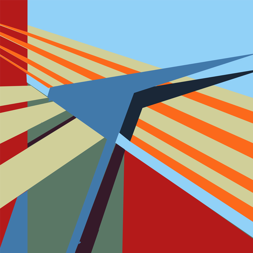
The final 4th design

This is the fourth final design. I think it now looks complete as an abstract piece of art. There is interesting perspective created with overlapping shapes, and there is a lot of dynamism created with the multiple directions of diagonals. 

I am not sure yet what I want to do with these pieces of art. They could be created out of Fedrigoni paper and used as advertisement as they are, but I do not think that this will do them justice. I think that they need to perhaps form part of a poster, or a series of posters. However, I do want to do a mock up of the posters as if they are in a gallery so that I can see them all together to see if anything is not working with them. 


This is the first layout attempt. I think that they all look good together, however the first poster on the left has a different feel to the rest of the posters because of the colour of the background. Therefore I am going to change the background colour to the colour of the background in the image on its right. 


This is the final layout of my posters. I think that they work great as a set. They have their own personality and are dynamic. I do not think that they would look out of place in a contemporary art gallery or a gallery of Futurism. Now I need to figure out what exactly I wish to do with them. My next stage is to experiment with futurist waistcoats, using a similar way of working to that which I have explored in these pieces of artwork. 


Monday 25 February 2013

Fortunato Depero

I really love the idea of linking futurism with Fedrigoni. Fedrigoni origionated in reverto, the home town of Fortunato Depero, an Italian futurist. I have been given a book, Case D Arte, which showcases the work by futurist Depero, and I think that I am going to use this as a primary inspiration for completing this project. I am imagining a slogan such as Fedrigoni Fururisti, Fedrigoni futuristic, or Fedrigoni E Futurista, fedrigoni is futuristic (I need to check the translation of these with an Italian speaking person).

Depero


Depero's work includes a lot of angles and bright colours. Dynamism is created through angled type, boldness of shapes and in some instances 3 dimensional form. The bright colour scheme which consists of greens, reds, yellows and blues, are placed on contrasting background colours to lift the subject and give the piece life. 


Geometry and shape are important in depero's work. Here, the figure is created out of circles nad rectangles. the final illustration is fun to look at but contains the dynamism and character of depero's futurist work. I know that the colour scheme that is used in Depero's work could be created using Fedrigoni paper. Fedrigoni produce over 400 types of paper with varying colour. One type in particular is the Fedrigoni sirio colour paper range. The colours in this are vivid and intense like the Depero colour scheme. Therefore, I will start designing with this type of colour scheme in mind. Using intense, bold colours to stand out from the page. 


This is another piece by Depero that I really like. I think that the combination of circles and diagonals creates a really strong composition. The colours are great. The blue/grey works really effectively with the dark red and orange. Everything about the piece is striking and bold. The image works really well as a piece of art. I could imagine this piece being produced on a really large scale, it would be very striking. 


Perspective is used here again in Depero's work. The text is set on the perspective lines, however does not change size. This is visually playful and really effective in making the text stand out. The actual typeface used I particularly like. Its letter forms create great dynamism and convey everything that Depero and futurism is about. I need to see if I can produce a typeface like this or use a typeface that is already existing in my Fedrigoni work. 


Again, Depero uses perspective, diagonal lines and circular lines to create a dynamic, bold image. Black works really well in these images, its used sparingly but really focuses your eye on paticular areas. The composition is really effective, drawing your eye upwards to the title. Even the small caption at the bottom of the image is angled to coincide with the central image to draw your eye upwards through the composition. This is something that I need to consider when producing my Fedrigoni artwork. Construction of composition will be particularly important. The use of geometry and angles to create dynamism is something that I wish to explore. 


This is another great example of Depero's work. The central image is 3 dimentional, however the perspective does not make a lot of sense. Instead, Depero has used perspective playfully. I really like the use of shapes cutting through text and altering the colour of the text when the shape meets it. The colour scheme consists of two reds- one for shadow and one for highlighted areas, and a green which is used for both foreground and shadow, again a play with perspective. Overall, the image is extremely visually interesting and unique. 


Sunday 24 February 2013

constructing a futurist styled waistcoat

I am going to produce some waistcoat ideas in the style of the futurists waistcoats. Fedrigoni wrote in the brief that they wanted to play on the idea that printers are generally overly smartly dressed. I know that I have concluded that that is not strictly true, but this is a way of getting around this and giving Fedrigoni what they want. I am looking at smart dress wear, but mainly I am playing on the Futurist aspect and the fact that Marinetti made his own waistcoats.


These three waistcoats have been designed by using my art posters as the patterns. I wanted a consistant set that works with my art pieces, however I do not think that they work very well. The shapes are too large and are intended for an a1 poster, not for a waistcoat. You loose detail in the work that should be included in the piece to give it an overall balance. Also, they do not really look anything like the origional. I need to be more dynamic in my approach to the designs. They need to be more complex in design and have more shapes that overlap.


This is a waistcoat that I have designed from scratch. I think that it is effective because it uses the smaller shapes that create a more complex pattern than in my previous attempts at it. This is the waistcoat idea that I will continue forward in my exploration of design. I actually want to make this waistcoat. I cannot get hold of really vivid paper colours like I would ideally need, however I am able to get quite close in the Daler and Rowney Camford paper selection. I will make the waistcoat out of this paper. It will not look as striking as if it was made out of Fedrigoni paper, however my budget does not allow me to use Fedrigoni paper. I have brought a waistcoat that I have disassembled so that I can get the flatplan of the waistcoat that I am going to construct. I am now just waiting on the male manikin so that I can create the waistcoat. It should be fun to create, but I have to make sure that the craft level is extremely high. I must be using sharp knives at all times, and make sure that the piece holds together well. I will use double sided tape to stick the paper pieces together as this will create a firmer bond. When completed, I hope to photograph it and use it in potential poster designs. 


Wednesday 20 February 2013

Marinetti's waistcoat

Below are Marinetti's Futurist waistcoats that he constructed and worn. They are great. They are fun and playful. Image sending a Futurist waistcoat like this, constructed out of paper, to a UK printer! They would have such fun with it. It would also be a way of playing on Fedrigoni's idea that all UK printers are smartly dressed (which I have suggested that this is not the case) in a subtle way that pleases both the UK printers and Fedrigoni. There is scope in this idea and I am going to develop it.


Sunday 17 February 2013

Italian Futurism


I really like Italian Futurism. The work has such dynamism and uses such a fantastic colour palette  The colours are rich and vibrant and the way that they played with perspective is particularly 
interesting. Their artwork reflects movement and speed in such a unique and interesting way. 
Perhaps this is an interesting angle to take for my Fedrigoni project. Perhaps I should be exploring the notion that Fedrigoni are a futuristic paper that has properties that no other paper supplier has because they are forward thinking and moe advanced than any other paper manufacturer? The dynamic lines through the composition and the repetition of lines and shapes to create perspective are what I am 
going to focus on when exploring how I could use this research in design work. 


The above image is really interesting. The way that the background is conveyed shows such dynamism. The geometry and form are really angular and the final image is visually stunning.